
30/8/2023 - 27/9/2023 | Week 1 - Week 7
Shofwa Alyadiena | 0350019
Design Exploration | Bachelor of Design in Creative Media
Lecture Notes
Week 1 - Introduction
To cut it short, the first seven weeks are meant to be focused on creating a design for either a wallpaper, device theme, watches or an open design. The rest of the weeks are to go into depth regarding the module's "exploration" theme. Examples given were mostly interactive (infobook, point-and-click, platformer) and emphasized the importance of playfulness to truly engage the audience in the design.
Instructions
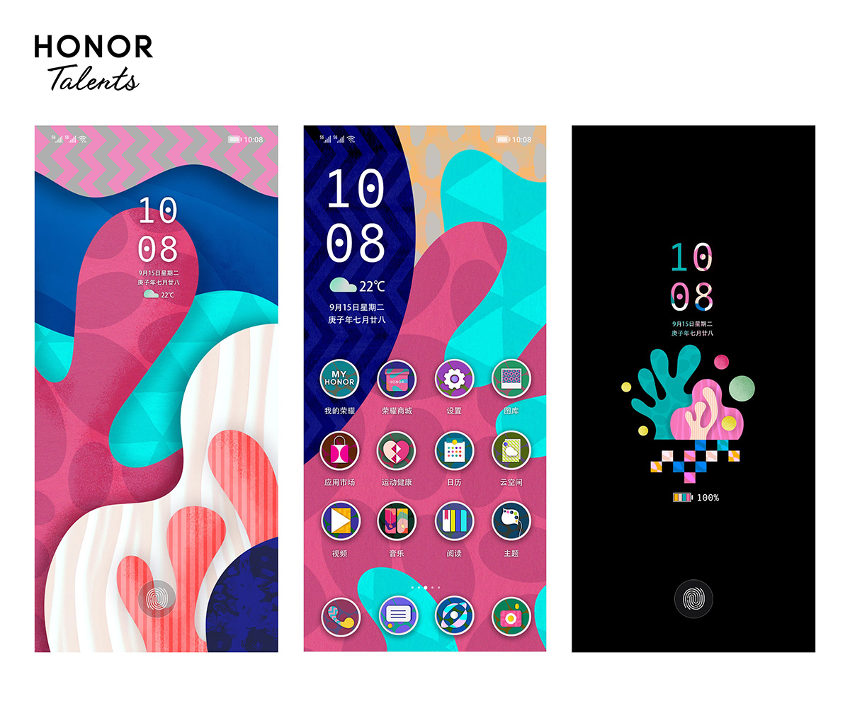
Visual Research and Initial Sketches
Our first task is to compile our research for the project proposal. The project is to submit a design for the October competition for the HONOR Talents Global Design Awards 2023.
Firstly, three concept options were provided to us:
-
1. Cultural Prosperity · Celebration: A Totem of Renewing Festive
Culture
Create with essential traditional cultural elements of various countries, such as Lunar New Year, Mid-Autumn Festival, Dragon Boat Festival, Christmas, Mother's Day, Day of the Dead, Halloween and Eid al-Fitr.
-
2. Renewal of life · Return: Contemplate human beings' relationship
with all things.
With sustainable development as the starting point, your creations must incorporate the concepts of environmental protection, biodiversity, energy conservation and emissions reduction within the design details.
-
3. Genesis · The Future: Imagine the Innovative World of the Future
The world of the future will be constructed with the power of technology and art, using creativity and imagination.
I decided I wanted to try and focus on Renewal of Life, as I rarely attempt the more organic shapes of nature in my designs.
The second decision we had to make was what type of design we'd like to submit: wallpaper, theme, watches, or open design. There was another one- art & technology- but the time we have wouldn't allow it.
Afterwards, I looked for inspiration from the previous winners of the contest.


From seeing the examples, examples of themes that don't strain the eyes are almost plain for the applications to take the attention instead; so I opted to choose a harmonious type of colour palette. At this stage, I don't pay attention yet to the "nature" themes and let the illustration be more nature-focused rather than the palette.
I then came up with the rough sketches for the first phase.

The first sketch I came up with (which I've titled 'Bloom') depicts a tree with a side profile similar to that of a person with butterflies surrounding it. I intend to have the person's state of consciousness ambiguous (life or death doesn't matter) to show that nature is one thing that'll always grow beautifully in various places, and we can directly be the reason nature thrives both in life and death.

I've titled the second sketch 'Cycle'. I'm not too happy with this one, but the idea is that though we (humans) believe we're the centre of everything, there are more living beings that occupy the globe.

The last sketch is titled 'Overgrown'. I don't actually like naming these, but they're better than sketches A, B, and C. Anyway, the idea of the sketch is centred around a forager- who's more freely enjoying living as opposed to the busy background of city life, which ultimately also causes a more varied biodiversity.
Feedback
- Doesn’t necessarily need humans to fit into the theme.
- Focus on the butterflies.
- Try to tell a story about the butterfly’s life cycle.
- Include endangered species to further emphasise the message.
- Explain the significance of butterflies to biodiversity.
Self-Directed Sketch Progressions #1
After the feedback, I started looking into butterflies a little further. Here are the options- for endangered butterflies native to Indonesia:
- Atrophaneura luchti
- Kuekenthal's Yellow Tiger
- Biak tiger
- Bonthain tiger
- Parantica
I really liked how the Atrophaneura looked (Figure 2.1). Unfortunately, I currently have no resources or references for the caterpillar phase's appearance.

Fig. 2.1 Atrophaneura Luchti
That being said, there's a general idea of what the rest of the life cycles look like, so I'll be using that as the current reference for the sketching, and hopefully can add detail later. Other than that, I remembered from a post I've seen (unfortunately, can't remember which specific one) about the microstructure of a butterfly wing (Figure 2.2). It's not important in this sketching phase, but I intend to use it as an overlay texture or as a reference for the overall painting style.

Afterwards, there are also the main flower that's favoured by butterflies, specifically the ones that commonly appear in Southeast Asia- These Guys:

There's no way you haven't seen them. I think it'll be a nice touch.


The first progress sketch. Breaking it down- the circles are representative of the butterflies' first stage, egg. It's heavily clustered. next to it are the caterpillars, then the chrysalis, and then the butterflies scattered about.
There are some little people scattered around the image as well, admiring the beauty of the cycle. This is partly for future story-telling, once I get to further explore ideas within this module. I then started to plan out the colours in the meantime.

This was a ROUGH rough coloured version. Ms. Anis showed me how the flowers/plants should take more of the screen. At this point, there were a lot of changes. Firstly, I gave up on drawing the "little people". Second, I originally wanted a low-contrast background for the application icons to shine. However, the deadline does not allow for a fleshed-out theme, so I went back to improve the values.


This was the moment I realized that It would be easier to use Illustrator for animation purposes. I traced it all and applied the reddish-orange hue to resemble the butterfly's body.
.png)
.png)
Finally, on to After Effects, I used simple animations and wanted especially the circle backgrounds to move slowly. I want it to feel crowded and have a sense of unison. I was rather pleased with the colour scheme.
Submission


Reflection:
Experience
I've never joined a design competition before, and I really liked how I did my design. I didn't really entertain the idea of butterflies much, and I strayed far away from the original ideas of the animation, but I really liked it anyway. The feedback given was insightful and reflected a lot on the prompts of the competition.
Observation
I absolutely loved being able to see my peer's works alongside mine. I especially loved the design one of them did for Mother's Day and replacing it with cats. It looked really clean to me and it was also what inspired me to move everything onto an Illustrator file rather than Photoshop.
Findings
While I was creating the animations, I actually wanted to try enhancing the "layered" effect by applying "doodle" elements to the finished look. I figured that it was a bad idea since I would have to go over the original overall design to make it consistent. However, in this process, I found that Photoshop had an animation option to "doodle over" animated videos. It's obviously a long and tiring work to do so, since it would classify as a frame-by-frame animation. Still, it's something new to me and I'm interested to find out how I can use it in the future.
Comments
Post a Comment