
22/04/2024 - 05/08/2024 | Week 1 - Week 14
Shofwa Alyadiena | 0350019
Design Portfolio | Bachelor of Design in Creative Media
Lectures
Week 1
The introduction week started with some general information regarding the information booklet. We were met with our roles in the module, between the admins, designers, media team, logistics team, and marketing team. I was placed in the design team of 6 members, under Wai Fern's appointed leadership. The lecturer proceeded with reminders of a portfolio creation, name card designing, and a Resume/CV to follow.
Week 2
For this week's meeting, our alumni came by to give us a short talk regarding burnout. There were interesting points regarding what they wish they knew about burnout from work- mostly about loneliness and imposter syndrome. They talked about the signs that we should look out for:
- Loss of motivation
- Detachment
- Fatigues
- Lack of creativity
- Cynicism
It was also mentioned that we could test ourselves using the Oldenburg Burnout Inventory which has prompts for self-reflection. We were reassured that it isn't a lonely process even if it felt that way, and were given tips to overcome it; such as bringing the "scary thoughts" to a pretend court. The way that it works is that we remind ourselves what the objective fact is, whether we are good enough or not, and that even if we aren't, there's always room to improve since life is about learning.
Finally, we were warned about being overworked and underpaid under the pretence of "we love doing what we're doing". We were reminded that our worth does not attach itself to our work, and the majority of the time it's important to know our worth.
Week 4
In the fourth week, we had another guest lecture from Stive. It's introduced as a website for freelancers or other illustrators to sell their artworks as tote bags or shirts and other physical merchandise. We were taught how to improve our personal marketing skills: mainly by increasing empathy with the consumers. It's important to know our audience.
Instructions
Visual Research and Idea Exploration
After the MIB briefing, we discussed our ideas for the theme of our exhibition. All six members were to propose a mood board, following name ideas and brief explanations. Below is the first draft of my idea.


 Fig. 1.2 Idea Proposal (29/4/2024)
After a group meeting, we decided that the main themes to be brought for proposal are a "DVD Gallery" and "Risograph" theme, where our individuality really shines through.
By the end of the meeting, we decided that the DVD gallery is more interactive and serves better as a base, and the risograph elements can be used for aesthetics. We voted to name our exhibition "24. Interlude", combining the music/DVD theme with "interlude" serving as a double meaning to us and our time between uni life and work.
LOGO
We then proceeded to be divided into teams, one to design logos and another for key visuals. I took up the logo task and proposed the following:
Fig. 1.3 Logo Proposal (6/5/2024)
Upon sharing the proposal, we all discussed which of our own sketches to proceed and refine, mine was to provide coloured examples of the third logo.

Fig. 1.4 Logo Colouring (6/5/2024)
In the end, we chose Cecil's logo and proceeded with making merchandise designs.

After countless complaints, the team leader Wai Fern updated the logo in the later weeks.

KEY VISUAL
I wanted to work on the key visual task to take a shot at what the batch would find pleasing. This was my proposal.

In the beginning, the idea was heavily revolved around DVDs rather than the retro vibes in its entirety, so it was the main focus of it all. They requested a clear sign that the shine on the discs were visible, and I tried to achieve that with the limited colours that we chose. I quite liked the designs I came up with, but I do agree it's lacking a lot of things.
Of course, everyone pointed out their distaste for the lack of any other element, so it was changed. Here is the final Key Visual from my teammate.

MERCHANDISE
1. Keychain
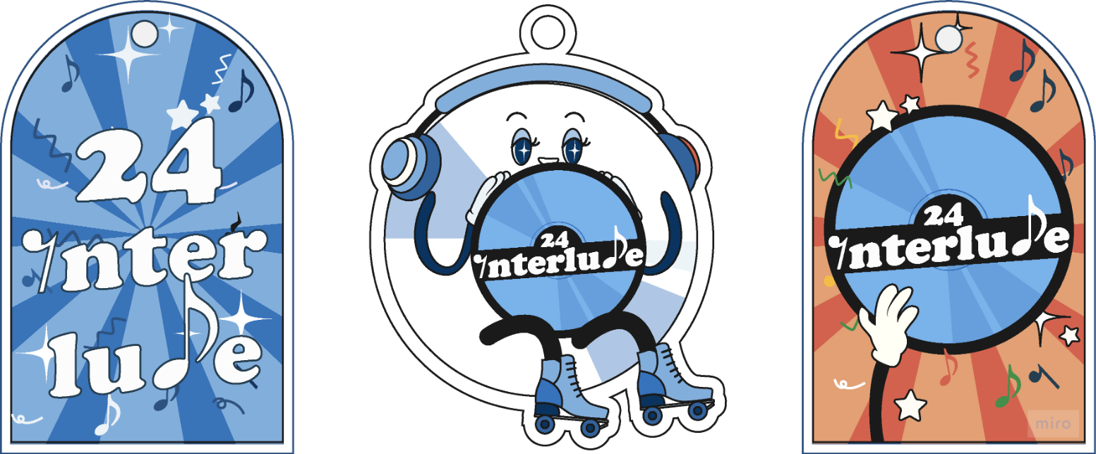
There was not much to say about the keychain design, it was either the mascot or the arch window design.
2. Totebag
Once we finally decided on the first logo, I worked on creating a totebag design. Originally, as I mentioned previously, it was mainly filled with disc elements and not much else to move on with.

However, after further feedbacks, the others thought it would be a neat idea to have a drawn space on the totebag designated for the badge that we will print. So, I worked with what I had.
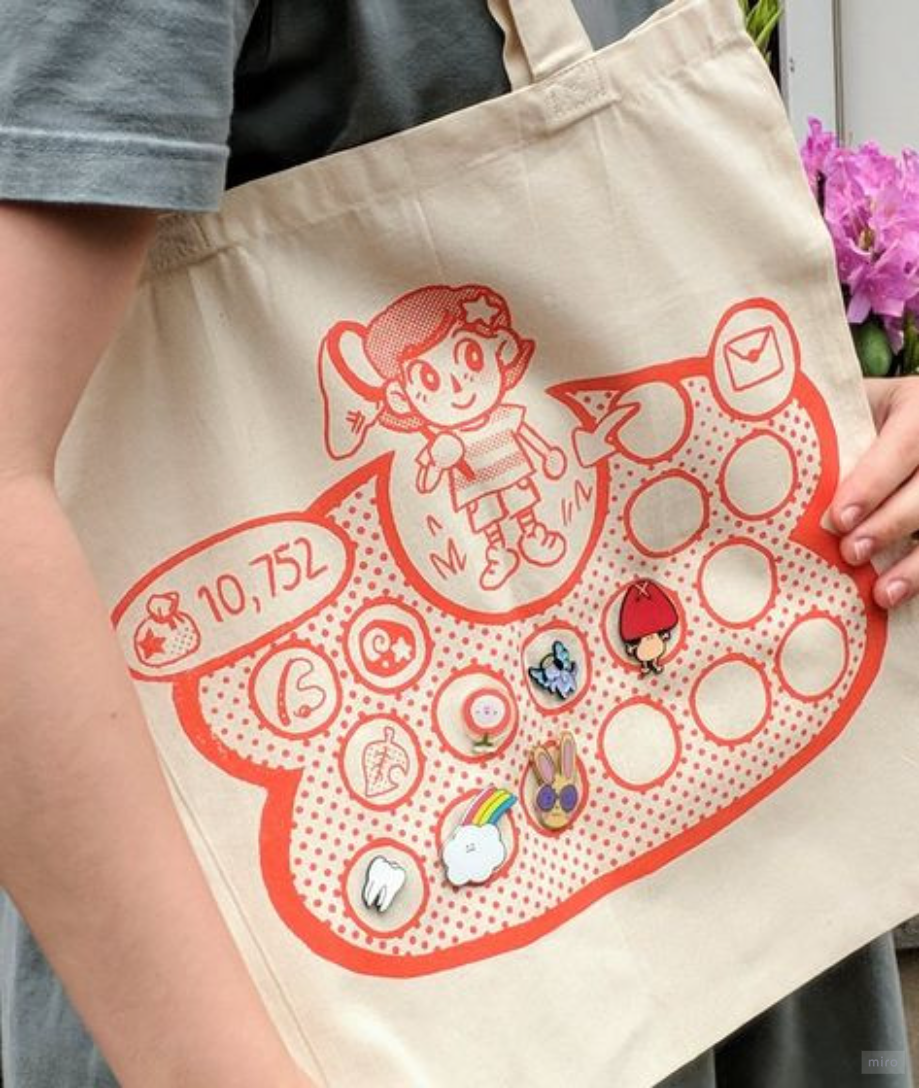

Originally, I assumed it would be possible for the totebag to be two-sided, hence why I worked on creating two sides that match each other. It was until later they've decided to stick with one-sided totes.


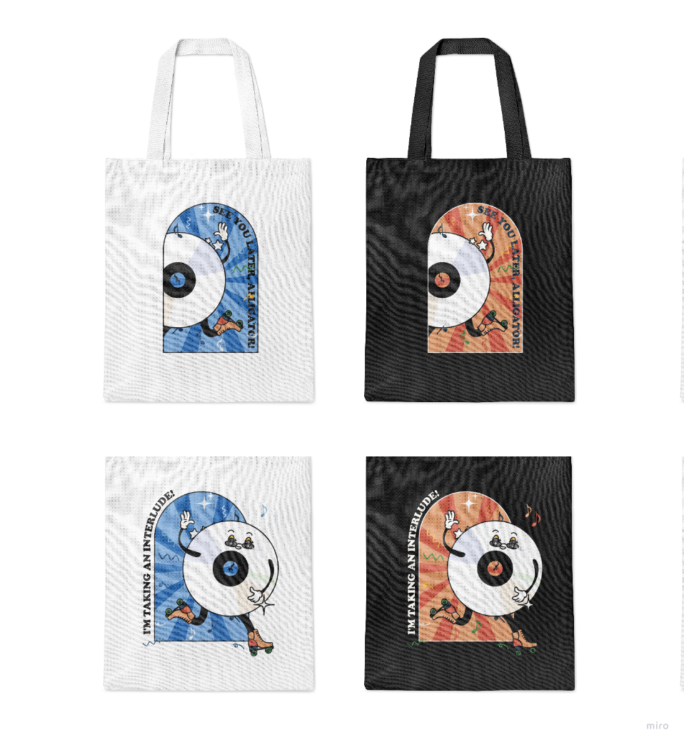
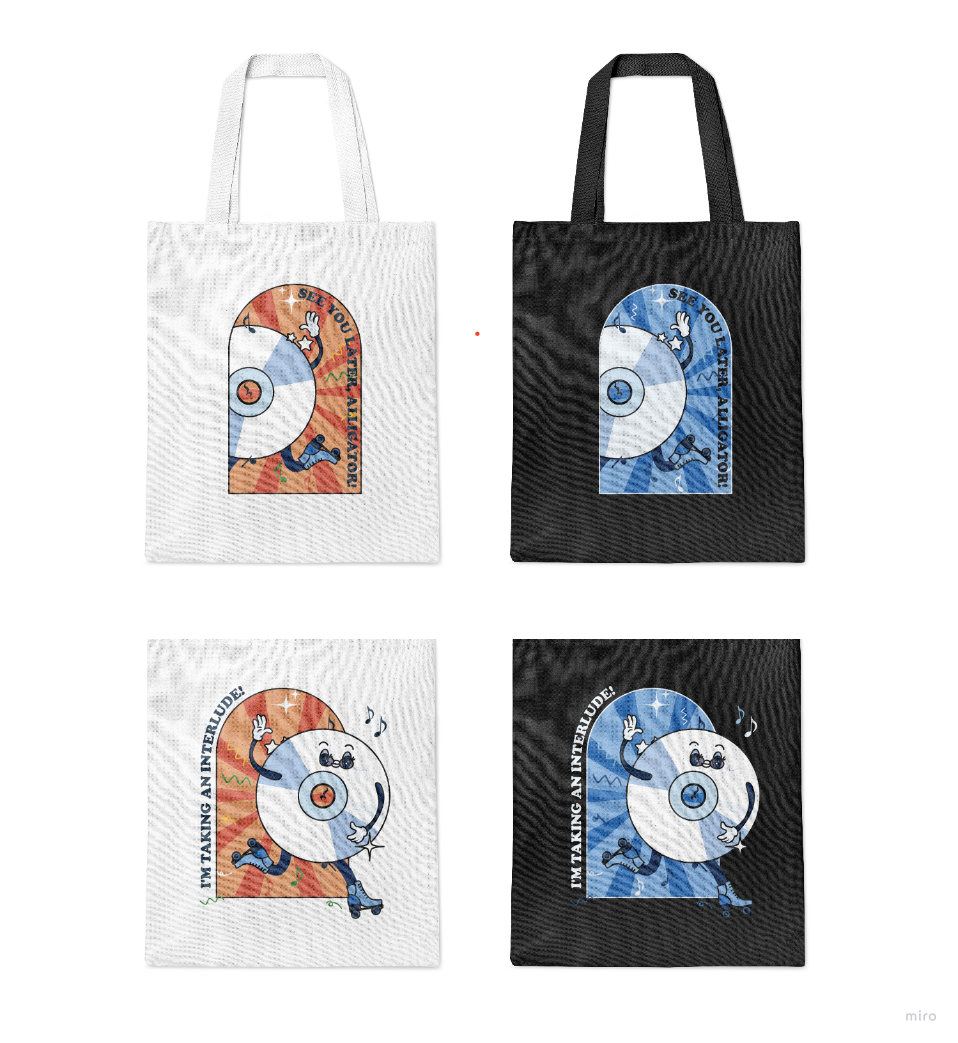

Finally, we've concluded to have the tote bag design as above.
3. Rubber Stamp
Prior to the rubber stamps, I was in charge of creating some presentation board designs. At this moment were the other modules starting to weigh on my time, so the next task delegation I requested to take the lighter work as to not make low quality designs. I chose to do rubber stamps because I think they're cute!

For the first draft I decided to use the mascots and the arched window again. I feel like the consistencies were needed, but realised soon after it did not have the vibe of a rubber stamp.

In the second draft, I've expanded upon the vertical and circle-shaped ones. I wanted it to show gratitude for the visitors as it would be stamped on to the postcards that are designed.

We finally settled on the "warm embrace" stamp.
DECORATIONS
Finally, once the merchandise was settled, we proceeded to grind the event decoration-making. We decided on mascot standees, glass door entrance stickers, mirror decorations, photo props, and floor stickers. I solely worked on the ones below.
1. Standees


After the feedback, everyone decided on 3 designs, one of which they requested further exploration on, mainly on the leg's posing.

After a quick voting, it was decided for the final small standee to be this one.

Fig. 6.3 Small Standee Final (28/7/2024)
2. Glass door stickers

At first the glass door was assumed to be 12ft by 3ft, and I worked on the stickers accordingly. The options was based on the theme being the retro-musical vibe, having either colours or the notes fly around. Of course, some designs were too much and I had to tone it down. It was a little rushed as all the ones for the later weeks were because of submissions piling up.

After minor adjustments they were sent to the other teams for feedback or approval, and after receiving the final true size of the door, I changed the sizes accordingly (14ft x 3.65ft).

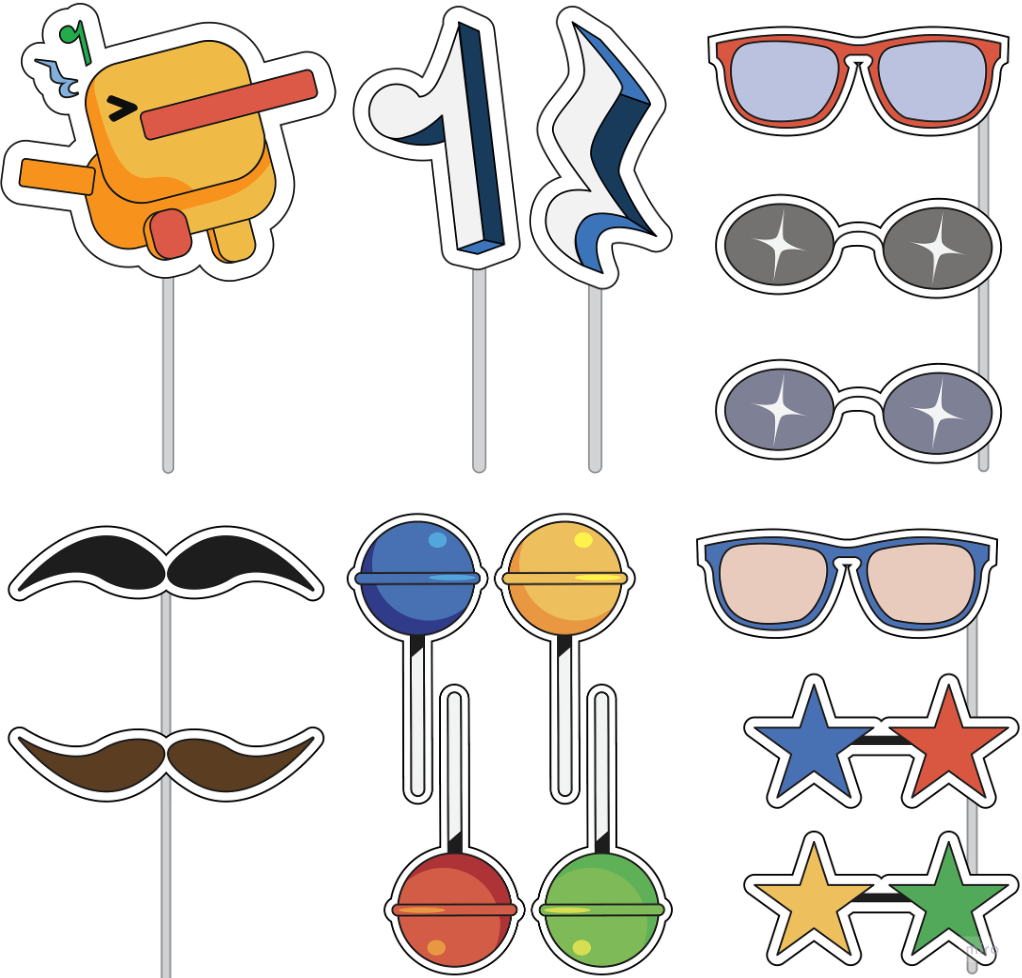
3. Photo props

Originally it was hard to understand if the others truly wanted photo props, so I made very little as an example more than anything. After it was approved, I moved them to an A4 size and created more based on the designs we made previously, and took inspiration from older photo booths.
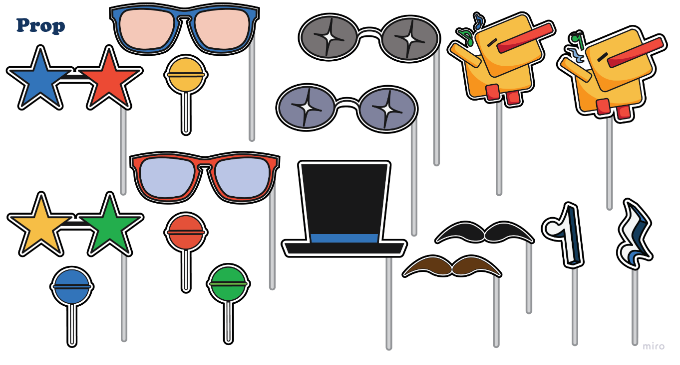
After refining it the second time, the others chose and provided feedback to come to the final designs below.
Individual Work
For the individual works, we were to create a showreel, design portfolio link, CV/Resume, and name card for personal branding. The resume will not be added here, for privacy reasons.
1. Showreel
Fig. 9.1 Showreel 2024 (5/8/2024)
2. Namecard
I designed the cards based on the one I have for my previous boothings, as I truly believe it expresses my identity.

Fig. 9.2 Namecard Front Face (5/8/2024)

3. Design Portfolio
Reflection:
My experience in this module greatly reminded me of boothing at conventions, and I was greatly excited to participate in it. My team was great and although I feel like there were some difficulties trying to please all the students with our designs, I found myself to be extremely pleased with what everyone had done. My favourite part was being able to see the products physically and understand that there was heart in them. I did get tired of the mascot after a while though, but it's all in good spirits.
Meanwhile, I realise that juggling with more modules than I should've taken was taking a toll on the amount of quality and quantity I can provide to my team, so I understand if they were not satisfied with what I've given, but am so very thankful they voice their concerns most of the time so that I may improve to produce better designs in the future!
Lastly, I was finally taught by my peers what should be done to prepare for printing my designs. I knew there were changes needed for the colour setting to be in CMYK, but I didn't know there were extra measures to be taken for illustrator-filed printing. The group helped me with that issues and again, I am genuinely very thankful for them.
Comments
Post a Comment